How to Use Image to Image AI Without Losing What Already Works
A first image is rarely a finished asset. It may have the right product angle but the wrong season. It may have a convincing portrait but an unusable background. It may already contain the beginning of a campaign, yet still need versions for a landing page, a social placement, a presentation deck, and the opening frame of a short video.
That is the useful promise of image to image AI. You do not begin with an empty prompt box and hope the model guesses your intent. You begin with a visual decision that already works, then ask for a controlled change.
The goal is not to create a completely different image. The goal is to make a better next version of the same visual idea.
Begin With a Source That Has a Clear Job
Image to image AI performs best when the input already gives you something worth protecting. A rough product shot, a location photo, a concept sketch, or an approved campaign still can all work. What matters is that the subject is readable and the image has a deliberate visual anchor.
For a product, that anchor may be the silhouette, label placement, camera angle, or color family. For a portrait, it may be the face, hairstyle, pose, and perspective. For an interior concept, it may be the room layout, window position, daylight direction, and sense of scale.
A source image does not need to be perfect. It does need to make one important decision for you. If the product angle is right, keep it. If the person feels natural in the frame, protect that pose. If the room already has the right proportions, do not invite the model to redesign the geometry by accident.
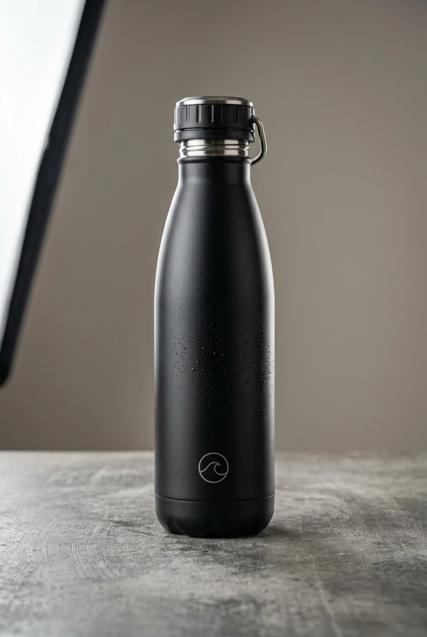
This is where many generations go wrong. The prompt asks for a beautiful new look but never identifies the visual information that cannot drift. The result may be attractive, yet still fail because it no longer looks like the product, person, or composition you approved.
Separate What Must Stay From What May Change
Before generating, make four decisions in plain language.
First, name the details that must remain fixed. That could be a bottle shape, a front label, a human face, a hand position, a room layout, or the negative space reserved for a headline.
Second, name one visual direction to explore. Choose the background, the lighting, the season, the styling, the material treatment, or the overall mood. Do not change all of them at once.
Third, define the finish. Tell the model whether the image should become a calm ecommerce hero, a polished editorial still, a product campaign visual, or a social asset designed to hold attention in a small crop.
Finally, name the errors you cannot accept. No altered packaging text. No extra products. No changed face. No distorted hands. No unrelated logos.
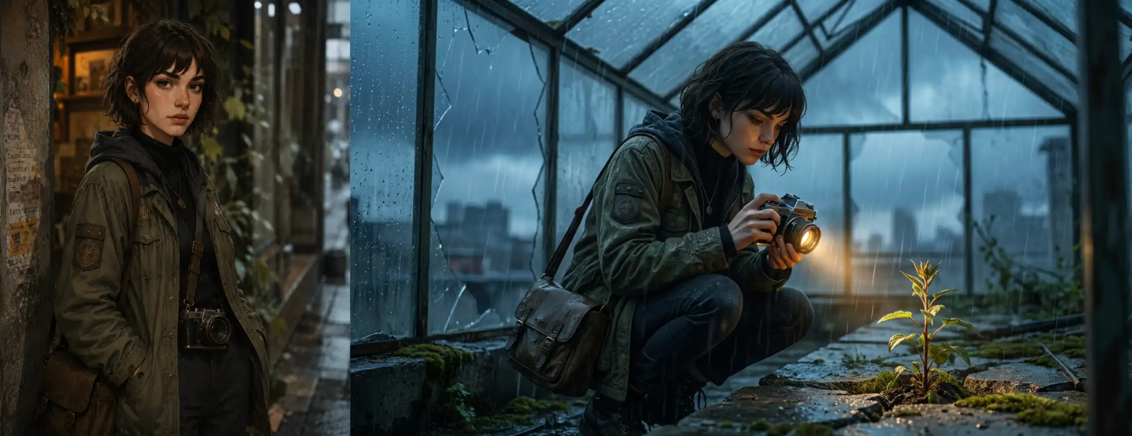
That structure gives the model a useful sequence. Protect the identity of the image. Make one meaningful change. Define what finished quality looks like. Then set the boundaries.
Here is a practical product brief.
Keep the bottle shape, cap, front label, and three quarter camera angle from the reference image.
Move the product onto a pale limestone surface with soft morning light from the left and a quiet shadow from a nearby plant.
Create a wide ecommerce hero image with clean negative space on the left, realistic reflections, and a restrained wellness brand mood.
Do not add props, change the packaging text, alter the logo, or distort the glass.

The useful part is not the limestone or the plant shadow. It is the early instruction to preserve the bottle shape, label, and camera angle. That gives the creative direction a stable surface to work on.
Change One Major Variable Per Pass
It is easy to see why people try to change everything in one generation. You have a source image and a long wish list. You want a new background, new lighting, a stronger mood, new props, a different lens feeling, cleaner typography space, and a fresh color grade.
That is often too much to ask from one pass.
A more reliable workflow changes one major variable at a time. Start with the background. Then test lighting. Then explore material treatment or camera mood. Every pass should answer a clear question. Does this setting make the product feel more premium? Does this light better suit the campaign? Does this crop still leave room for the message?
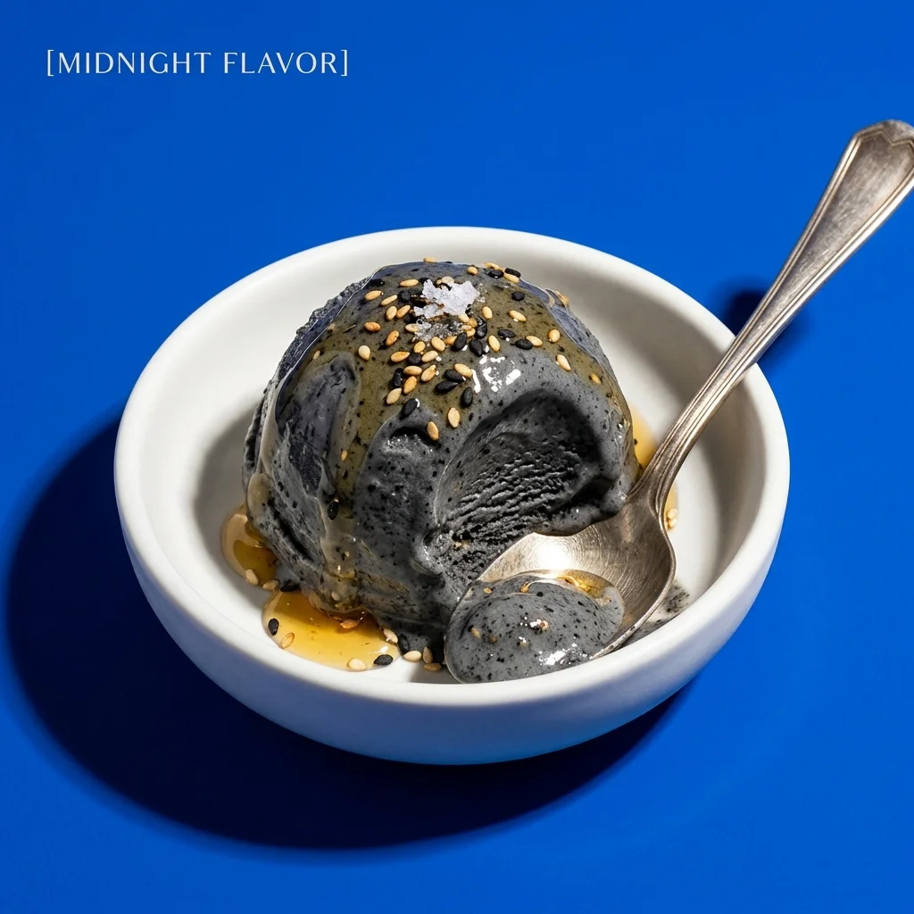
You gain more than a collection of options. You gain a record of cause and effect. When one result works, you know what changed. When it does not, you can revise one decision without throwing away the whole direction.
In diffusion based image workflows, the amount of change is also a creative control. Lower strength settings generally retain more similarity to the initial image. Higher settings give the model more freedom to depart from it. At the extreme, a setting of 1.0 can largely ignore the starting image.1
You do not need a universal number. Models expose their controls differently. The practical rule is enough. When source structure matters, begin conservatively. When you intentionally want to replace the visual direction, allow more freedom.
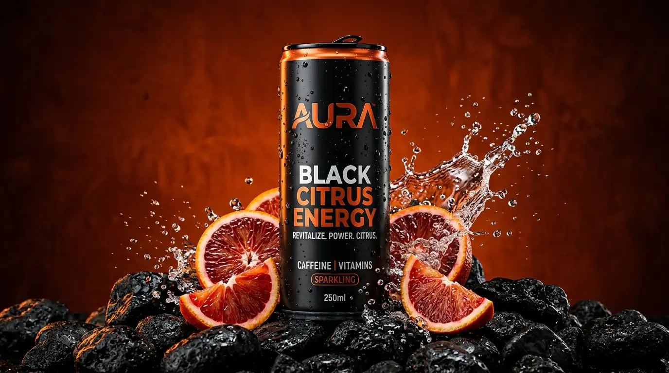
Use a Preservation Brief for Targeted Edits
Some assignments do not need a full restyle. You may only need to remove one object, replace a background, introduce a new prop, or clean an image before it enters a deck.
For these tasks, a preservation brief is more useful than a long mood description. State exactly what should change. Then name the nearby visual relationships that must remain coherent. A new background should respect the original light direction, focal length, depth of field, and contact shadows. A new object should have the correct scale, perspective, and point of contact.
Replace only the background behind the reference subject with a warm late afternoon bookstore interior.
Keep the subject’s face, hair, jacket, pose, hands, camera angle, and expression unchanged.
Match the original lighting direction and color temperature. Keep the same shallow depth of field and realistic floor reflections.
Do not change the clothing, body proportions, or any object already held by the subject.
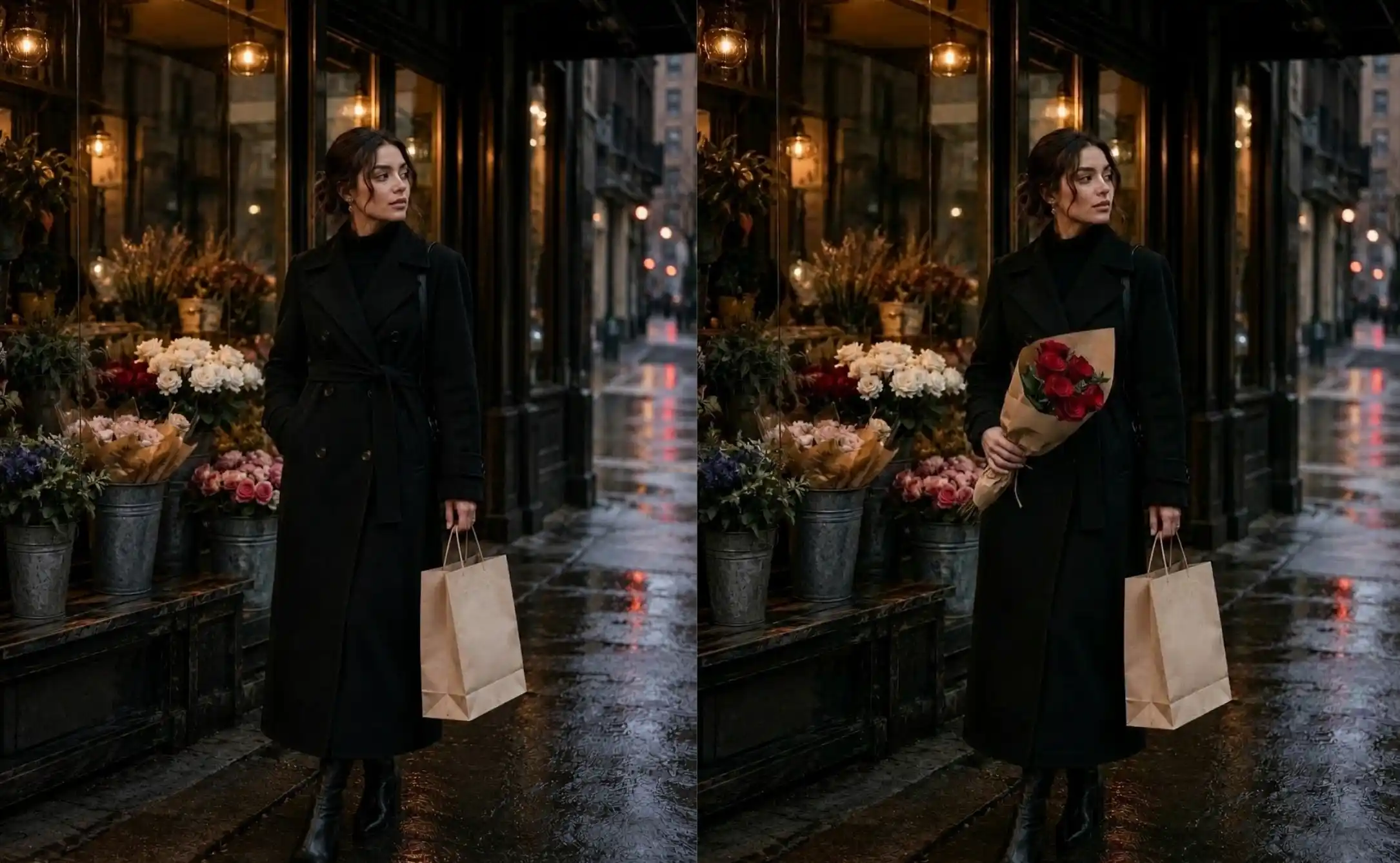
The evaluation becomes much clearer. You are no longer asking whether the image looks beautiful in the abstract. You are checking whether the edit obeyed the brief.
Name the Destination Before You Generate
A vague request for a better version leads to vague output. Name where the image must go before you generate it.
Call it the autumn landing page hero, the brighter social variant, the concept board visual, the vertical story crop, or the clean opening frame for animation. A named use case forces decisions about aspect ratio, crop, negative space, and what must remain legible.
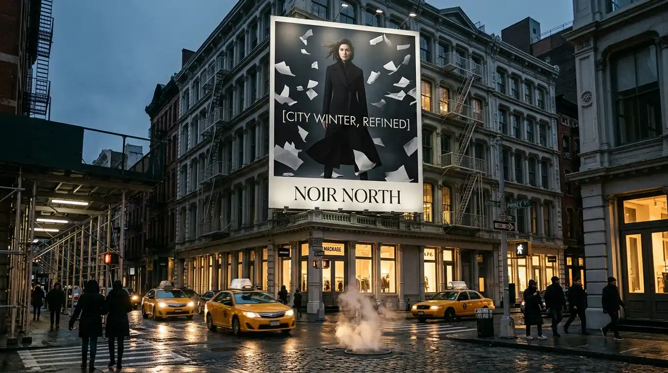
A visual can look impressive when viewed full screen and still fail in its real placement. Test it at the target size. Check whether the subject is still recognizable. Confirm that a headline can sit where it needs to sit. Make sure the visual direction remains clear after the image loses most of the screen.
Run a Small Comparison Loop
Creative teams often lose time after generation. They make twenty variations, open them side by side, and find that none of them can be explained or repeated.
A small comparison loop is easier to use. The first pass checks structural fidelity. Is the subject accurate? Does the composition still hold? Are labels, faces, and important objects intact?
The next pass checks the visual direction. Did the new light, location, or styling actually move the image somewhere useful? The final pass checks production readiness. Can the result work at the intended crop, with the intended copy space, and in the intended brand context?
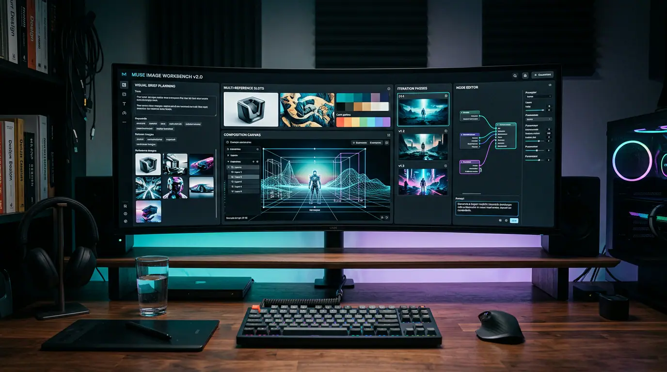
Once you have a clear reference and a specific change to test, a workspace such as Image to Video AI’s Image to Image tool becomes a natural execution step. Its reference guided workflow is designed for restyling, redesigning layouts or backgrounds, making controlled variations, and polishing details. It can also carry a selected still into an image guided video workflow when the image needs to become more than a static asset.
Bring a brief, not just an image. Upload the source. State what must remain recognizable. Change one variable. Compare the result with the reference before moving to another direction.
Carry a Proven Still Into Motion
A successful image to image result can become a stronger starting frame for animation.
This is especially helpful for short product ads, concept trailers, and social clips. Instead of asking a video model to solve the subject, setting, lighting, and movement all at once, establish the still image first. When the subject and art direction are stable, the motion prompt has a simpler job. It can focus on what moves, how the camera travels, and what should stay calm.
A final still is not merely a deliverable. It is a decision you have already solved. Carry that decision into the next medium, and you reduce the number of creative choices that have to be rediscovered from scratch.
Check Before You Publish
Before an image leaves the creative workspace, ask four questions. Is the subject still accurate? Is the requested change obvious? Does the image work in its real placement, not only at full screen size? Do you have the right to use the reference image, brand assets, people, and output in the intended context?
Image to image AI is not the right tool for every correction. If the task requires exact label edits, legally critical text, or precise engineering geometry, conventional design and retouching tools remain safer. But for controlled variation, art direction exploration, and turning one promising image into a family of useful assets, it gives you a valuable capability.
You can keep the decision that already worked and continue the work from there.