Awesome DESIGN.md (2026): From Google's Open Format to a Demonstrable AI UI Workflow
Learn how Google DESIGN.md differs from the awesome-design-md collection, how to adapt and validate a design system file, and how to turn a finished AI UI into a clear short product demo.
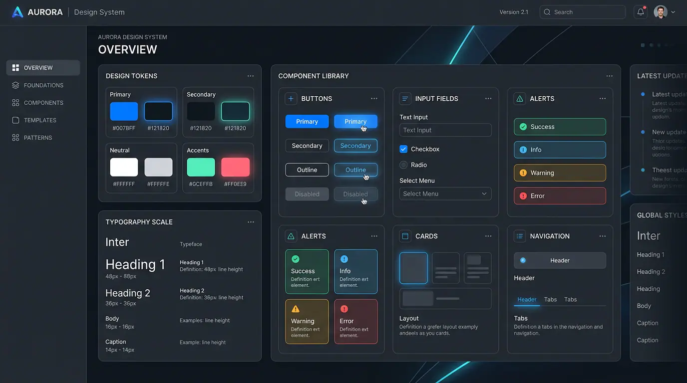
An AI-generated interface can create two very convincing illusions. It looks like a product, so the team assumes it has a product. It looks cohesive, so the team assumes it has a design system. The illusion usually breaks when someone adds another page, an error state, or a mobile layout. Why is this button blue? Which spacing rule applies here? What should an empty state sound like? What happens when a generation fails?
The point of DESIGN.md is not to give an AI another instruction such as “make it look like a well-known brand.” Its job is to turn the design decisions hidden inside a screenshot into a design contract that both people and agents can read. Once a static interface is the starting point, the next two jobs are to make it repeatable and to make it easy to explain.
The practical thesis of this guide is simple: treat
awesome-design-mdas a library of design decisions to study and adapt, not as a one-click brand-cloning kit. Once your static UI is stable, use a concise video to show the design logic in motion.
First, clear up the naming: Google DESIGN.md and awesome-design-md are not the same thing
These two names are often mentioned together, but they do different jobs. In April 2026, Google Labs open-sourced the draft DESIGN.md specification from Stitch: a self-contained, plain-text representation of design rules. Its purpose is to help agents understand why a color exists, how components should behave, and how visual choices can be checked against constraints such as accessibility. Google’s announcement emphasizes that the format can move across tools and platforms, while the official specification defines it as a plain-text expression of a brand and product’s visual identity.
VoltAgent’s awesome-design-md, by contrast, is a community-maintained reference collection. It documents the design languages of familiar developer-focused products as readable DESIGN.md examples, with preview pages alongside them. In short, Google provides a format and direction; awesome-design-md provides material you can inspect and learn from.
| What you are looking at | The problem it actually solves | What it is not |
|---|---|---|
| Google’s DESIGN.md specification | How to express design rules in a form that people and agents can inspect | A fixed visual theme or a configuration every tool must support verbatim |
| Google Stitch | How design rules can be imported, exported, and used across projects | The only product capable of reading DESIGN.md |
| The awesome-design-md collection | How established products make decisions about color, type, components, and space | A template library to copy without thought |
| Your project’s DESIGN.md | How to preserve your product’s visual reasoning as reusable constraints | A written transcription of a single screenshot |
That distinction matters. If you treat the collection as a skin generator, the first screen may look familiar while every later screen falls apart. If you treat it as a record of design decisions, it can help your team establish its own visual boundaries much faster.

Why an AI UI workflow needs DESIGN.md in 2026
In a conventional handoff, Figma files, component libraries, and conversations collectively preserve design memory. Once AI participates in interface production, there is another memory problem: the model has to re-decide color, density, borders, hierarchy, and tone every time it generates. When those decisions only exist in a handful of reference images, the result depends too heavily on the prompt of the day and becomes difficult to review.
DESIGN.md makes that memory explicit. A good file does not need to read like a design-theory paper, but it should let a reader answer four questions: What should this product feel like at first glance? How is information layered? How do components change across states? Which changes are never acceptable?
The awesome-design-md README commonly organizes its examples around visual atmosphere, semantic color, typography, component styling, layout principles, depth and elevation, do’s and don’ts, responsive behavior, and agent prompt guidance. The value of that structure is not that every section must be exhaustive. It is that it covers the information most likely to disappear when a UI moves from “looks good” to “behaves consistently.”
Do not choose the example that looks most similar; choose the one that matches your product problem
When people open the collection, the first question is often, “Does my product look more like Stripe or Linear?” That is rarely the strongest starting point. Ask instead: “What kind of information is my user handling? Is it dense or lightweight? Are they comparing, creating, monitoring, or completing a transaction?”
A high-frequency B2B console needs you to study scan paths, data density, status color, and shortcut behavior. A consumer creative tool needs you to study onboarding rhythm, breathing room, emotional tone, and how work is displayed. Both could use dark surfaces and rounded cards; their design systems would still be based on entirely different reasons.
| Design question to inspect first | What to find in a reference example | What to preserve in your own product |
|---|---|---|
| Information density | How much judgment fits in one view; how tables, filters, and sidebars coexist | The scan rhythm and information priority, not a copied layout |
| Brand atmosphere | Color proportions, whitespace, contrast, and the frequency of decorative elements | Your own emotional keywords and contrast rules, not the original brand colors |
| Component behavior | How buttons, inputs, and cards change when hovered, selected, or disabled | The logic between states and the strength of feedback |
| Reading hierarchy | The relationship among headings, explanations, data, and calls to action | The order in which users should understand the page |
| Responsive behavior | What collapses, moves, or disappears on small screens | Task priority, rather than a shrunken desktop layout |
A useful rule follows: borrow the structure, not the identity. You may learn that the primary action deserves the only high-saturation color, or that supporting text should never compete with primary data. You should not import another company’s brand palette, signature visual motifs, voice, or product language into your own UI.
Turn one reference example into your own design baseline in three passes
Reading an entire DESIGN.md in one sitting often leaves you with vague impressions: “clean,” “polished,” or “futuristic.” A more reliable approach is to make three passes, each producing a different conclusion that you can verify.
Pass 1: Translate the visual intent instead of copying adjectives
Start with a one-sentence visual thesis. It must be specific enough to rule choices out; “modern, professional, and clean” does not qualify because it could describe almost any product. “Keep the creative flow lightweight, while making generation status and rights information unmissable” is much more useful because it guides actual decisions.
Next, rewrite the reference example’s color and hierarchy choices as semantic roles of your own: page background, primary surface, weak divider, primary action, success, risk, and low-priority text. Notice that these are roles, not swatches. You can iterate on exact values later. If roles are confused, every subsequent screen will be confused too.
Pass 2: Add states and boundaries to every important component
AI can often make a convincing default state and then overlook the states that matter in a real product: an empty input, a failed request, insufficient permissions, changed pricing, or a job in progress. Your DESIGN.md should describe high-frequency components as a state chain, not merely a static appearance.
The following excerpt is not an official required template. It is a practical starting format for a new project because it keeps visual judgment and interaction boundaries in the same place.
## Primary action

- Role: advance the user’s one primary task; never use it for a secondary link.
- Default: high-contrast fill; concise verb-led label; clear breathing room around the control.
- Hover / focus: strengthen brightness or outline without shifting the brand hue; keep focus visible.
- Disabled: lower emphasis while preserving legibility; never make it look clickable.
- Loading: preserve the button’s size and label position; show progress without causing layout shift.

## Empty states

- Explain why this area is empty before offering one low-friction next step.
- Do not use illustration to hide a missing explanation; if a task cannot be completed, state why.
Pass 3: Write down what must not happen
Visual appeal is not the whole point of DESIGN.md. The rules that cut rework are often the negative constraints: do not use two equally strong primary CTAs on one page; do not put important status information in low-contrast gray text; do not hide form errors in the name of minimalism; do not treat mobile as a compressed desktop screenshot.
These rules can be plain, but they must be testable. “Keep the interface restrained” is much less useful than: “A marketing view may contain at most one high-saturation filled CTA per viewport, except during payment or a destructive-action confirmation.”

Validation: stop asking “does it look right?” and ask “does it still work on another page?”
The first DESIGN.md test should not be another landing page. Ask an agent to create a page with pressure: an empty activity history, an upload flow with errors and retries, a mobile filter drawer, or a settings view with much denser information. If the rules only hold on the homepage, you have a moodboard. If hierarchy and state logic remain intact across different tasks, you are getting closer to a design system.
A small validation matrix is enough to expose most gaps.
| Test page or state | Do not check only | Check this instead |
|---|---|---|
| New-user empty state | Whether the illustration is attractive | Whether the next step is clear and the product tone remains consistent |
| Generating or loading state | Whether it has animation | Whether feedback is stable, the layout stays still, and waiting is explained |
| Error or insufficient-permission state | Whether red is prominent enough | Whether the user understands the cause, keeps their work, and can recover |
| Dense list or table | Whether the screen feels “premium” | Whether important data can still be scanned and the primary action is not buried |
| Mobile view | Whether every desktop element survives | Whether the user’s most important task becomes easier to complete |
This is where you discover what must be written back into the file: perhaps semantic status colors, narrow-screen priorities, or limits on how many CTAs can appear. The compounding benefit of the collection comes from writing failures back into the rules.
Once the static design passes, turn it into a short video that explains one thing well
After an interface is stable, design review and product launch work often hit a different kind of friction. A static image cannot show where attention should travel, how a new task begins, or what a completed generation looks like. At this stage, a short video does not need to teach the entire product. It only needs to make one important action visible.
A general AI video-prompt structure can be written as “camera movement + scene + action + details.” Runway’s video-prompt guide likewise recommends choosing one primary action and defining the camera clearly. For UI demonstrations, both the camera and the action should be even more restrained: the screen is the subject, and the motion should guide attention rather than turn the interface into a visual-effects reel.
Use the following working prompt as a starting point, then revise it to fit your actual screen, brand language, and workflow.
6-second product-interface demonstration. Use the uploaded interface as the exact visual reference: keep all text, brand colors, icons, grid, button locations, and information hierarchy unchanged.

The camera slowly moves toward the primary action area. Show one clear press on the “Generate” button, then let the result card appear smoothly.

Keep the movement restrained, stable, and professional. Do not add new text, controls, people, products, or dramatic transitions. Do not warp interface text or icons.
If you already have a key screen validated through DESIGN.md, you can upload it to Image to Video AI, describe the subject movement, camera path, and mood, and then select the aspect ratio, resolution, duration, and frame rate for the channel where the clip will appear. In this workflow, the tool is not designing the UI for you. It is turning an approved static design into a previewable, downloadable short demonstration. DESIGN.md protects the visual logic; the video makes that logic legible to people who are reviewing, presenting, or discovering the product.
The point is not to make the screen move more. It is to make the motion more controllable. Split your prompt review into four checks:
| Prompt element | What to specify in a UI demonstration | Why it matters |
|---|---|---|
| Visual anchor | The exact screen and area that should remain the reference | Prevents the model from enlarging or inventing irrelevant visual elements |
| Camera | A slow push, a gentle pan, or a locked shot—choose one | Directs attention without interrupting information reading |
| Primary action | One click, one progress change, or one result card appearing | Reduces state confusion and the risk of warped text |
| Elements to preserve | Copy, icons, colors, layout, and component positions | Protects the design decisions already approved in DESIGN.md |
Three common mistakes—and the more reliable alternative
Mistake 1: treating the reference collection as a brand-cloning library. A stronger approach is to annotate every borrowed idea: what you borrowed, why it fits, and how it becomes your own. If you cannot answer the last question, do not put the decision into your DESIGN.md.
Mistake 2: teaching the agent only colors and border radii. A stronger approach is to record states, hierarchy, whitespace, and non-negotiable boundaries first. Color is only one rule. The consistency users feel usually comes from feedback as they move through a task.
Mistake 3: adding too much motion just to make a demo feel impressive. A stronger approach is to identify the one question the clip must answer: does it guide a first generation, reveal a completed result, or emphasize one setting? Keep only the camera movement and interaction that serve that answer. A short video should lower the cost of understanding, not add visual noise.
From “looks similar” to “reusable and explainable”
The most valuable lesson in awesome-design-md is not the number of recognizable products it documents. It is the reminder that every interface that “just looks right” is built from decisions that can be named. Turn those decisions into your own DESIGN.md, validate them across pages and states, and then use a restrained short video to explain one key task when you need to bring more people into the conversation.
That is how AI stops guessing at your taste from scratch in every prompt. It starts working from a set of design rules that can be discussed, revised, and shown. That is the part of DESIGN.md worth investing in during 2026.